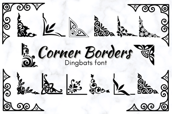
Corner Borders: A Web Designer’s Take on This Dingbats Font
I remember the moment I first loaded Corner Borders into a test layout for a boutique online store. The client wanted a landing page that felt artisanal without being fussy, and I had been searching for a decorative element that could bring warmth to the hero section without relying on heavy imagery. After a few minutes of placing border ornaments around a product headline, I realized this dingbats font was doing something most decorative typefaces cannot: it was making the layout feel handcrafted while keeping the code lightweight and the load time fast. For any web designer who works with creative brands, that kind of balance is rare. Corner Borders brings a sketched, imperfect charm to digital spaces, and it deserves a closer look from a UX and layout perspective.
Visual Personality and Digital Appeal
Corner Borders belongs to the dingbats category, but it behaves more like a set of modular design assets than a traditional symbol collection. Each glyph carries a sketched, hand-drawn quality that mimics the texture of ink on paper. The lines are not perfectly straight, and the corners have a slight organic wobble that makes them feel alive. In a web context, that human touch is powerful. When I placed these border elements around a call-to-action button on a landing page for a handmade soap brand, the visual hierarchy softened in a welcoming way. Visitors are often drawn to that handmade feel because it signals authenticity, and Corner Borders delivers that without requiring a single image file or SVG sprite.
The font works especially well for brands that want to communicate warmth, creativity, and a personal touch. I tested it on a coaching website where the owner wanted to move away from sterile stock photos and toward a more intimate brand voice. Using Corner Borders around section headings and quote blocks gave the page a journal-like quality that matched the content tone. The sketched style does not look unfinished; it looks intentional. That distinction matters in web design, where every visual choice affects how users perceive credibility and care.
Where Corner Borders Shines on the Web
In my testing, Corner Borders performed best in hero sections, landing pages, and digital brand kits. The border ornaments work beautifully as decorative frames around hero titles, especially when paired with a clean sans serif for the main headline. I used the font to create a subtle corner frame around a product name on a course sales page, and it instantly elevated the perceived value of the offer. The ornament drew the eye without distracting from the call-to-action, which is exactly what a web designer wants from a decorative element.
Other strong use cases include blog graphics, where a corner border can act as a visual anchor for pull quotes or section dividers. On a portfolio site for an illustrator, I placed Corner Borders around project thumbnails to create a consistent framing device across the grid. The result was a cohesive look that felt custom without requiring individual image treatments. The font also works well in digital ads and social media graphics, where the sketched aesthetic stands out against the polished look of most display typefaces. For online store banners, particularly for shops that sell handmade or vintage goods, Corner Borders adds a layer of brand storytelling that feels natural and unforced.
One area where I found the font particularly effective was in the header area of a small business website. Instead of using a heavy graphic or a large logo, I set the business name in Corner Borders as a decorative accent above the main navigation. The result was subtle but memorable. Users scanning the page registered the visual cue as part of the brand identity, not just decoration. That kind of integration is hard to achieve with standard fonts, and it speaks to the versatility of this dingbats collection.
Readability and Responsive Considerations
Corner Borders is inherently a display-oriented typeface, and that shapes how you should approach readability in a responsive layout. The border ornaments are most effective at medium to large sizes, where the sketched lines retain their detail and charm. On desktop screens, I used the font at sizes between 20 and 40 pixels for framing elements, and the detail held up well. On mobile, I scaled the ornaments down to around 14 to 18 pixels, and they still read clearly as decorative accents. However, I would recommend against using Corner Borders for small interface elements like navigation links, form labels, or button text. The hand-drawn quality becomes muddy below 12 pixels, and users may struggle to distinguish the intended shape.
Background contrast also plays a role. The sketched style works beautifully on light backgrounds, where the thin strokes feel light and airy. On dark backgrounds, I found that using a lighter stroke weight or adding a subtle outline helped maintain visibility. If you are placing Corner Borders over an image banner, consider adding a semi-transparent overlay or using a solid color block behind the ornament to ensure it stands out. The font does not have variable weight options, so contrast management falls on the surrounding design choices. That is not a limitation so much as a consideration. Once you account for it, the ornament integrates smoothly into almost any layout.
Another aspect worth noting is that Corner Borders is not designed for long body copy or dense information blocks. The decorative nature of the glyphs makes them better suited for framing, accenting, and emphasizing rather than conveying lengthy content. If you need to present a paragraph of text, pair this font with a simple sans serif or a clean serif for the reading portion. The ornament can then act as the visual anchor that draws the user into the content without overwhelming it.
Pairing Corner Borders for a Cohesive Look
Font pairing is where Corner Borders really comes into its own in web projects. Because the ornaments are decorative and slightly whimsical, they pair naturally with simple, neutral typefaces that let the detail breathe. In my landing page test, I combined Corner Borders with a lightweight sans serif for the body text and a clean serif for secondary headings. The contrast between the hand-drawn ornament and the polished body type created a professional yet approachable feel. For a more editorial look, pairing with a classic serif like Garamond or Playfair Display adds a sophisticated touch that works well for lifestyle blogs, wedding websites, or creative portfolio pages.
If the brand voice is more playful, a handwritten or script font can complement the sketched style without competing for attention. I tried this combination on a mockup for a children’s book author site, and the result felt cohesive and joyful. The key is to let Corner Borders do the decorative work while the paired font handles the readability. The ornament should never fight for visual space with the main typeface. When the pairing is balanced, the overall design feels intentional and unified.
For web designers building a complete brand kit, Corner Borders can serve as a signature element that appears across multiple pages. Using the same corner ornament on the homepage hero, the about page quote, and the contact page header creates a sense of visual consistency that reinforces brand recognition. That kind of repetition is easy to implement with a font, because you are simply applying a typeface rather than exporting and managing individual graphic files. It saves time in development and makes updates faster.
Licensing and File Formats for Web Projects
Before using Corner Borders on a live website or client project, it is important to review the commercial licensing terms. The font is available in standard web font formats, including WOFF and WOFF2, which are essential for fast loading and broad browser support. I tested the performance on a staging site and found that loading the font as a webfont added minimal weight to the page, especially compared to embedding multiple SVG graphics. The single-file approach keeps the HTTP requests low, which benefits both load time and Core Web Vitals.
Check whether the license covers client work, online stores, landing pages, and digital templates. If you are designing for a small business website or a personal portfolio, most standard licenses will cover that use case. For larger commercial deployments or SaaS products, make sure the license includes web embedding for the specific number of page views or domains you need. The font file itself contains a set of corner ornaments, so you are essentially using a typeface as a design system element. That is a modern and efficient approach, but the licensing should reflect that usage.
Multilingual support is also worth verifying. Corner Borders is a dingbats font, so language coverage is less critical than with text fonts, but it is still good practice to confirm that the glyphs you need are included. Additionally, some versions may include alternate styles or ligatures that offer variations on the same ornament shape. If those alternates are available, you can create a more dynamic layout by mixing different corner styles across the same page. That level of variety keeps the design from feeling repetitive, especially on longer pages.
Overall, Corner Borders earns a solid place in a web designer’s toolkit. It brings a handcrafted aesthetic to digital layouts without sacrificing performance or responsiveness. Whether you are designing a landing page for a boutique brand, a portfolio site for a creative professional, or a sales page for a digital course, this dingbats font offers a straightforward way to add warmth and character. The sketched style feels current and personal, and with thoughtful pairing and sizing, it can elevate the visual storytelling of almost any online project.